

What’s in a name? Or, more importantly, what’s in a logo?
With Barack Obama—and now Mitt Romney—the answer is “not much.” At the same time, however, one could also answer “a whole lot” and still be correct. After all, a picture is worth a thousand words—just words.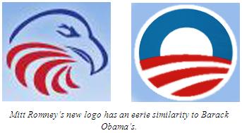
While the “O” in Mr. Obama’s logo obviously stands for the senator’s last name, perhaps “U” would have been a better choice considering the ubiquitous nature of said illustration. You practically cannot walk to your own mailbox without the iconic “O” glaring at you from somewhere.
It can be found on bumper stickers, campaign signs, and even mock-up presidential seals. Obama supporters, most likely uneducated on the specifics of their candidate, walk around with t-shirts proudly bearing nothing but the logo. The Senator even had the hopeful audacity to remove the American flag from his campaign plane, replacing it with the omnipresent “O”.
It has truly permeated the entire 2008 political campaign. It is everywhere at all times. In fact, it’s almost divine—similar to the messianic candidate it represents.
Any student of history—especially those who’ve studied the fascist and totalitarian regimes of bygone eras—should understand the power of a simple, unifying symbol used to rally the masses to a cause. For Mr. Obama, there is no name, message, or objective content to his logo. Only colors and shapes.
And it has proven to be wildly successful. Interesting.
Now it seems that Mitt Romney has taken notice. The former presidential candidate is the Honorary Chairman of the new Free and Strong America PAC, which, according to their website, pledges to support:
“…officeholders and candidates who are dedicated to promoting public policies that will strengthen America at this critical time in our history.”
It also seeks to:
“…advance conservative social, fiscal, and foreign policies that are essential to our nation’s strength and freedom.”
So what exactly is the problem? Although the goals of the Free and Strong America PAC seem noble indeed, the graphic designer for the group appears to have taken to low road in crafting their logo. As one can see, the Free and Strong America PAC’s logo is eerily similar to that of Mr. Obama.
Both logos feature the curving swoops of red (Romney’s, of course, with five instead of three). Both also feature a rainbow-shaped blue arch with both end points connecting back to the red portion. Granted, the Free and Strong America logo forms the image of an American eagle, it is clear that both logos are based on a simple circular composition.
Come on, Mr. Romney. You can do better than this. Although the Free and Strong America logo obviously contains more inherent, upfront content, why should anyone stoop to copy-cat tactics? Besides, imitation is the best form of flattery—and heaven knows Mr. Obama has gotten enough of that lately.
The simple fact is that now is not the time to imitate. In all matters—not just logos—principled conservatives ought to be leading and setting the agenda.
Following, reacting, and compromising have never been—and should never be—central tenets of limited government conservatism.
http://www.getliberty.org/content.asp?pl=37&contentid=37#A_Tale_of_Two_Logos